Using the Spotlight Homepage Layout
Put your most important message front-and-center where it can’t be missed.
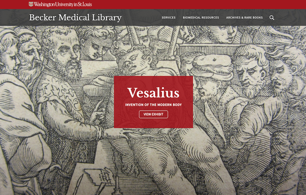
Spotlight is a homepage layout option that pairs a full-screen image with a text box overlay, making it ideal for websites that have a single or focused call-to-action.
Learn more about the Spotlight Homepage’s features »

How to apply the spotlight homepage
The Spotlight homepage layout is achieved by condensing the header, uploading a larger-than-usual featured image and overlaying the image with a text box.

1. Designate your site’s homepage
If you haven’t already done so, select which page will be the homepage.
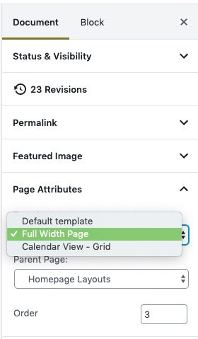
Make sure the homepage Template is set to Full Width. (When editing your homepage, select Document in the top right panel, then scroll down to Page Attributes.)
2. Condense the header to enable Spotlight
The condensed header must be selected for Spotlight options to appear when editing your homepage.
- From your site’s dashboard, go to Appearance > Customize; or, from the black admin bar at the top of any page, click Customize.
- Click Header.
- Select Condensed. A preview of your site’s homepage will appear.
- Click Publish.
Good to know: The affiliation will not display if the condensed header is selected, as shown in the screenshots below.

3. Set the featured image (expanded size)
The Spotlight layout uses an expanded featured image that is much larger than the standard featured image.
- Ideal size: 2880 x 1440 pixels (w x h)
- Minimum: 1440 x 720 pixels (w x h)

Choose a high-quality image that will make an impact. Environmental shots, scientific images and textures may work best since the center of the image is overlaid with a text box and the edges cut off at different sizes, depending on a visitor’s browser window and device (e.g. desktop computers, tablets, smartphones).
To insert a featured image:
- Edit the homepage.
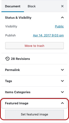
- In the top right panel, click Document > Set featured image.
- Upload the image and set its attributes.
4. Edit the text box overlay
When editing the homepage, a Spotlight Overlay module will appear below the page content.

Click Add Element to add a heading, subheading and button to the text box overlay.
Overlay color:
The default color is red to distinguish the overlay as a primary call-to-action. You may change the color to better suit the featured image’s color palette or change the content’s emphasis.
5. Don’t forget to save!
Click Publish or Update to save the changes to your homepage.