Adding Buttons
Make a critical call to action stand out from other content on the page using a button.
A button acts as a highly visible link, making it ideal for important actions like applications or registrations. You can add buttons to body text, or insert them into graphical blocks like cards and billboards.
Related Guides
How to use the button block
New to building pages in blocks? Get to know the block editor »
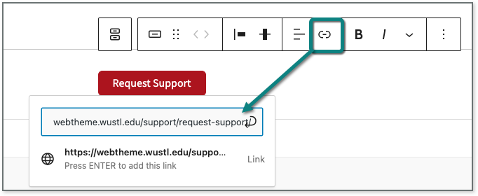
- Click the Add block icon to insert the Button block.
- Click on the link icon in the top toolbar and enter the destination URL for the button in the field.
- If you’re linking to a page or post within your site, simply type in the title and select the page or post from the list. (Internal site content must be published before you can link to it.)
- Click on the button itself to add text. If you don’t add text, the button will still appear (and it will look very strange!).
See tips for writing clear and effective button text » - Change the style of the button in the block settings in the panel on the right. (See examples below.)
- Use the primary (default) for the most important action on a page. Try to only use one primary button per page.
- Use the outline style if additional buttons are needed, or if you’re adding two parallel calls to action.
- Adjust the alignment of the button in settings in the top toolbar. Leave the button aligned left (default) unless the content above it is centered. Button alignment should match the content above it.
 Pro Tip
Start button text with a verb to motivate your site visitors to take action.
Button examples
The theme has two different button styles. This allows you to establish a visual hierarchy so the most important links stand out.
Primary style
Red background, white text
Reserve primary buttons for a site’s most important links. Use two on the same page only if the links have equal priority.
Outline style
White background, red text
Use the outline style for follow-up actions to the primary button or when creating multiple parallel links as buttons.
Primary call to action with follow up
Below, the outline button (See application status) provides a follow up link that doesn’t detract from the primary action (Apply online).
1. Complete your application
- Submit the online application by December 1.
2. Check your application status
- Log in periodically to check on the status of your application.
Parallel actions
These outline buttons link to pages that are of parallel importance, depending on the person visiting the site.
Meeting spaces
Whether you need a small meeting room, a large auditorium, or something in between, we have a space for you.
Event planning
Need a hand? From flip charts and furniture to catering and clean up, our services have your meeting covered.
Button inside a billboard to draw attention to a signature event
If you add a button inside a billboard block, the theme will automatically adjust the button color to match.
Assemble. Listen. Learn.
The Assembly Series, Washington University’s signature lecture series, features luminaries and visionaries, intellectuals and creatives, leaders and pioneers.