Creating Flexible Layouts With Columns
Use columns to bring visual balance to your layouts.
Columns allow you to divide a section of a page into two or three columns of various widths. This intro, for example, uses a two-thirds / one-third column block to hold paragraphs on the left, and a card on the right. On mobile devices and smaller browser windows, the right column stacks below the left.
You can use columns to display related information or to present content of parallel importance. It’s important to consider how columnar content will adjust on smaller windows and and across devices, including mobile phones (see section below on responsive design).
How to use the columns block
New to building pages in blocks? Get to know the block editor »
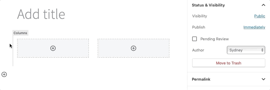
First, add a columns block to the page.
- Select your desired layout from the block’s pre-designed options to get started. Don’t see the layout you want? Don’t worry…
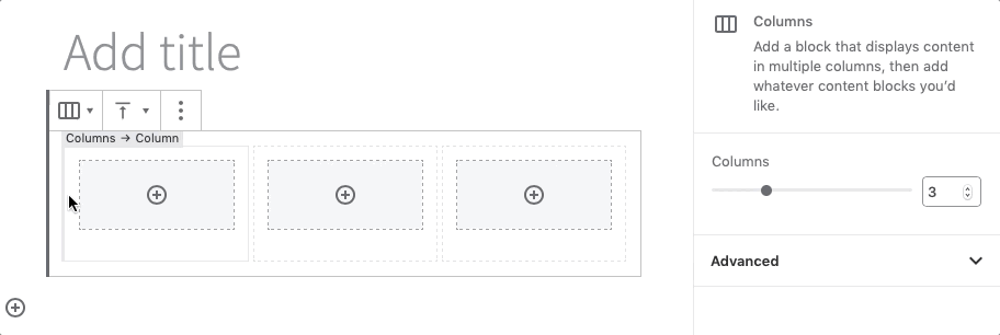
- Customize the number of columns by first selecting the exterior columns block and then changing the number in the Columns slider in the block settings in the right panel.
- Customize layout by selecting an interior column and changing the Percentage width slider under Column Settings in the block setting in the right panel.
- Click the encircled plus sign to add blocks to your columns, or drag existing blocks into your columns.
- Vertical alignment (top, center or bottom) can be set in the settings menu in the toolbar at the top of the columns block.
Then, add your content.
There are two ways you can add content inside columns:
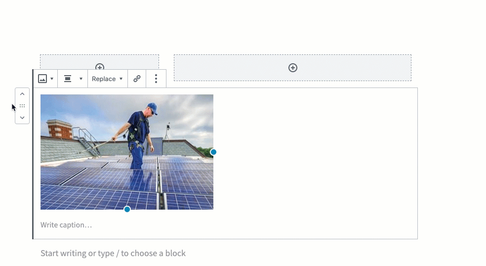
- Click the Add Block symbol inside the column, and select the block to add.
- OR, create the content outside of columns. Then select and drag the block(s) into the column block, releasing when you see a blue box around the column.
Deleting or moving a columns block
Columns can be tricky to work with since the blocks are nested — the parent columns block contains inner blocks for individual columns, which in turn include blocks for headings, paragraphs, lists, etc. The nested blocks tutorial demonstrates how to select different levels of parent and inner blocks so they’re easier to delete, move, and work with.
 Always preview!
To see what your page will look like to site visitors, save a draft and click “Preview.” Some elements, like cover blocks and columns, can preview differently on the backend of your site. And be sure to test your layouts in various browsers and screens (i.e., mobile devices)!
Ways to use the columns block
Putting cards in columns
Display dual-degree programs using cards in columns, as we do for these School of Medicine degree programs below.
MD/PhD
Also known as the Medical Scientist Training Program (MSTP). Equip yourself for a career of scientific investigation combined with the practice of medicine.
MD/MA
Provides an individualized research experience in an excellent environment, where students are encouraged to explore a wide range of research possibilities.
MD/MSCI
Master’s of Science in Clinical Investigation (MSCI)
This unique program combines didactic coursework with mentored research and career development opportunities and provides students with the knowledge and tools to excel in the areas of clinical investigation most relevant to their careers.
MD/MPHS
Master’s of Population Health Sciences
This five-year combined degree program focuses on clinical epidemiology, quantitative analysis, biostatistics, research methods and research ethics.
MD/MPH
Master’s of Public Health
Explore the foundational areas of public health including policy, behavior, environment, epidemiology, biostatistics, planning, evaluation and research.
Using columns within a cover block
In this example, we inserted a two-thirds / one-third column design inside a cover block, but only added content to the one-thirds column on the right.

Important Dates
- File your intent to graduate by Dec. 3
- Rent your cap and gown by Feb. 18.
- After the Ceremony: Diplomas will be available for pickup during the reception.
Pairing related content or content of equal importance
Displaying content side by the side helps a site visitor infer that the content is related or of equal importance. Below we use columns and cards to showcase Olin Business School’s “MBA three ways.”

Full-Time MBA
A two-year program in which an intensely personalized curriculum allows students to target areas of interest, develop career-specific skills and capitalize on hands-on learning opportunities.

Professional MBA
An evening program designed for working professionals that features a class cohort system in which students attend classes with the same individuals for their first four semesters.

Executive MBA
Offered in St. Louis, Shanghai and Mumbai, these 18- or 20-month weekend programs emphasize strategy, leadership, the design of effective organizations and global competitive markets.
Columns are particularly useful when displaying items of parallel importance, such as testimonials, news stories…or presenting literary greats’ pontifications on love.

Love looks not with the eyes, but with the mind, and therefore is winged Cupid painted blind.
William Shakespeare

Love is or it ain’t.
Thin love ain’t love at all.
Toni Morrison
Using columns when designing layouts for mobile
In responsive design, column content will adjust to smaller windows by first stacking top to bottom, from left to right, so it is important to consider how your elements will present on a mobile device. If content relies on the surrounding context, pay special attention to layout, and always test on multiple devices and screen sizes.
For example, if we swap the design above so that the quotes are next to the authors, rather than below, all looks fine on a computer…
Love looks not with the eyes, but with the mind, and therefore is winged Cupid painted blind.
William Shakespeare
Love is or it ain’t.
Thin love ain’t love at all.
Toni Morrison
…but drag your screen to phone width to replicate the effect of viewing this layout on mobile, and the quotes stack together, divorcing content from context and ruining the design intent.
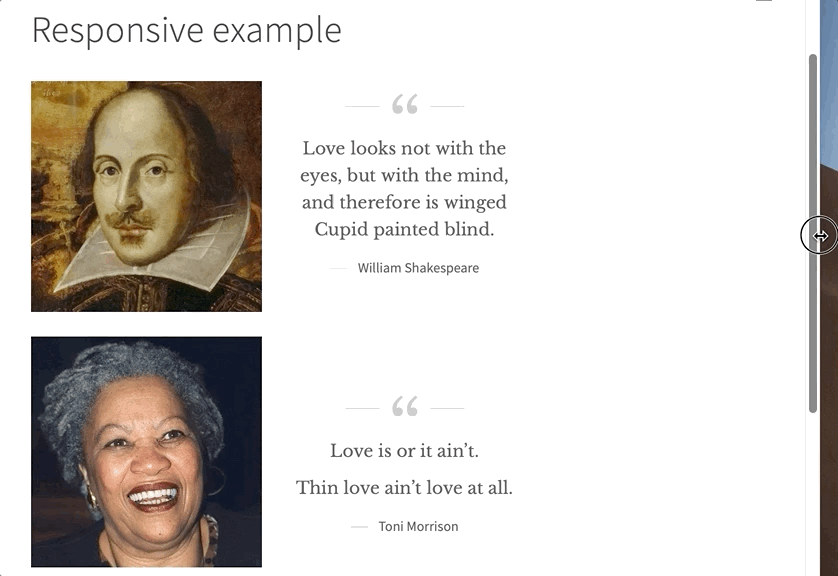
Instead, in this case you could create two separate column blocks, one for each pairing of the image and corresponding quote.