Overlaying Text on an Image with the Cover Block
Use the cover block to add readable text over an image or mimic a parallax effect.

A visual way to introduce new sections
of a post or page.
Use this versatile and powerful block to introduce new sections in long-form storytelling, shake up stale page layouts or call attention to facts and figures in a highly visual and search engine-friendly way.
The text that overlays the image is “real text,” meaning it is readable by screen readers, search engines and translation tools. This makes the cover block an accessibility-friendly alternative to uploading an image with text locked into it as a part of the image.
With the cover block in your design arsenal, the possibilities are endless.
How to use the cover block
New to building pages in blocks? Get to know the block editor »
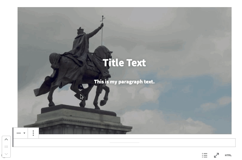
- Add a cover block.
- Upload an image file, or select an image from your media library if you’ve already uploaded it.
- Add a title. The title box included in the cover block is a paragraph block — the default content editing block — but the title text is automatically made larger and bold as part of the cover block.
- Adjust text alignment and image alignment separately:
- Text: The title text will be bold and centered by default. You can format the text using the settings in the top toolbar.
- Image: By default, cover blocks are centered, spanning the width of its container (i.e., full-width if the container is the content area, or smaller if inserted into a column). Use the settings in the top toolbar to left- or right-align the entire block, allowing text to wrap around it.
Image considerations
- Portrait vs. landscape: For a centered cover block, use a landscape/horizontal image. For a left- or right-aligned cover block, portrait/vertical images works best.
- Color and brightness: Upload an image dark enough for the text, which is white, to be legible on top of it.
- You can add more content items — such as paragraphs, quotes, lists (see list example below), headings and even a button* — by dragging blocks into the cover block or clicking the encircled plus sign. You can also transform existing blocks into other content types by clicking the first icon in the top toolbar.
*Add a button to a cover block only if you’re confident the button color will contrast with the cover image colors. You can avoid this challenge altogether — but achieve similar impact — by adding a billboard instead.
- Adjust additional optional settings for the background image in the block settings in the right panel:
- Use the focal point picker to identify the most important point of your image. This ensures that this visual point will not be cropped out of your image, regardless of screen size. Selecting the focal point picker will automatically position your image using the horizontal and vertical position values.
- Set the height in pixels to override the default block settings. Minimum height: 50 pixels.
- Selecting fixed background will lock the image in place on the page as the surrounding content scrolls around it, mimicking a parallax effect (see fixed background example below). This movement can be disorienting for site visitors and even cause nausea, so use this feature sparingly.
Selecting blocks within blocks
Cover blocks can be tricky to work with since the blocks are nested — the parent cover block contains inner blocks for paragraphs, buttons, etc. The nested blocks tutorial demonstrates how to select different levels of parent and inner blocks so they’re easier to work with.
Cover block examples
The cover block has lots of potential beyond full-width hero images. Behold just a few examples below.
To complement the visual composition of the image below, we aligned the title text right and moved it to the bottom of the image using soft returns (shift + return).

Where people matter
and serious work is done.
Animated gif as cover image
This cover block features an animated gif as the image.
Our recommendation: Use gifs sparingly, because they tend to have large file sizes, which can slow down page loading time.

Gut Health 101
Dr. Jeffrey Gordon
Fixed background (parallax)
The fixed background makes the image appear to stay in place as you scroll down the page. Fixed backgrounds typically have the most impact when inserted within a page body, rather than used as a header image at the top.
We recommend images that are abstract, environmental (think landscapes and architecture) or textured (rows of books, microscope slides, etc.), rather than images with people or important detail. A fixed background can be disorienting for site visitors and even cause nausea, so use it sparingly.
Considerations for using parallax effects on websites »
You can still use a text overlay on a cover image with a fixed background …
The fixed background stays static as you scroll down the page. Test for legibility as the text moves over the image.
… or make it text-free!
Using columns to create a sidebar
Since you can resize, align and wrap the cover block, it is a useful tool for making simple infographics. Or, use columns to organize a infographics as sidebars. Get creative!
Here, the cover block is placed in a one-thirds / two-thirds column to share facts related to the main content.

Rated #1
Business Insider ranks St. Louis the #1 city for Millennials to live and work.
St. Louis: A home in the heart of it all
St. Louis consistently ranks among the most affordable cities in the U.S., and the city’s dozens of neighborhoods and surrounding suburbs — each with their own perks and personalities — invite you to find the perfect place to call home.
Because St. Louis tends to keep a low profile, newcomers are often surprised by its abundance of character, culture and entertainment. In fact, the city earns accolades from techies, foodies, music-lovers and outdoor enthusiasts nationwide.
![]() Pro Tip
Pro Tip
Left or right alignment does not always translate well to mobile devices. As always, preview your pages on multiple devices such as desktops, laptops and mobile devices to make sure everything is appearing as expected.
Added a list block and set a focal point
Below, a list block was added within a column and aligned left to highlight important reminders without overlapping the main content of the image. In addition, we made the people’s faces the focal point so they won’t be cropped out as the image adjusts to different browser and device sizes.

Application To-Dos:
- Complete your application. Submit your application by December 1.
- Check your application status. Log in periodically to determine when your application is complete.